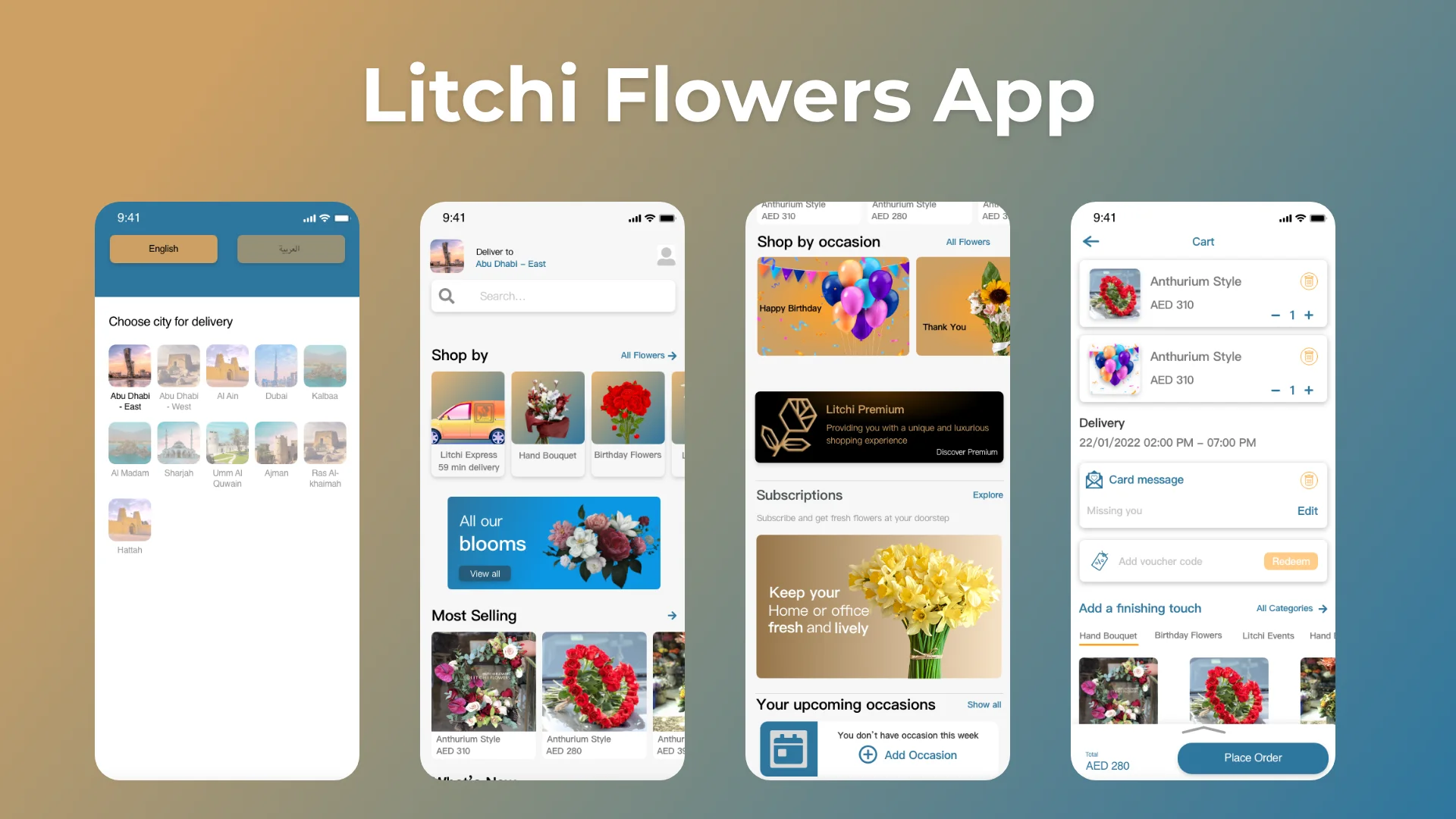
Litchi Flowers has one type of user flow, but they are so sensitive. So I’ve successfully created user-centered design to help them delivers their feelings easy, simple to use and good looking as well.
Taking the time to draft iterations of each screen of the app on paper ensured that the elements that made it to digital wireframes would be well-suited to address user pain points.
For the home screen, I prioritized a quick and easy ordering process to help users save time.


